
District Tracker
Welcome to the District Tracker! This page brings together a suite of interactive visualizations that map and compare India’s administrative landscape as of 2025, spanning districts, subdistricts, and their distribution across states and Union Territories. These visualizations allow you to explore the structure and scale of India’s administrative units - from high-level national patterns to district-level detail - through intuitive tools such as comparative bar charts, population-weighted bubble plots, and a clickable district map. This page is a work in progress, and we will soon be adding more advanced, real-time trackers that capture ongoing changes to districts, including splits, merges, and re-namings as they occur. Scroll down to the bottom to learn more about the data behind these visualizations.
Visualization 1: This interactive radial chart visualizes the administrative hierarchy of all Indian States and Union Territories, allowing users to filter any State to view its districts and their constituent sub-districts. Each district is positioned at the center of its own ring of sub-districts, providing a clear, comparative window into regional variation in administrative organization across the country.
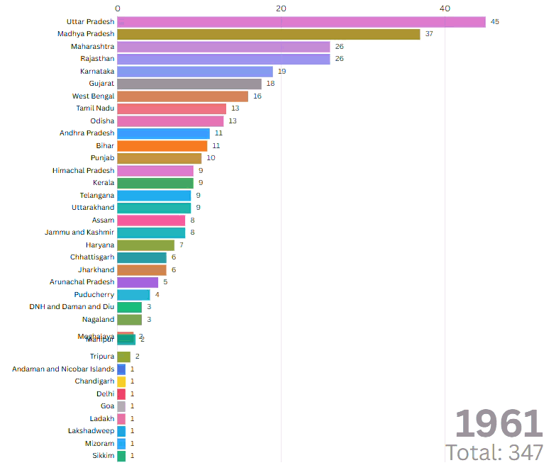
Visualizations 2: This animated race bar chart illustrates how number of districts changed and evolved in each state over the decades, from 1961 to 2025.
Visualizations 3 & 4: The following two bar charts illustrate the number of districts and subdistricts across India's 28 States as of 1 December 2025. Together, they highlight how State size, governance needs, and historical boundary changes produce striking differences in administrative scale - from large, densely governed States with many layers of local administration to smaller States with far leaner structures.
Visualization 5: This bar chart compares the number of districts and subdistricts across India’s eight Union Territories (UTs) as of 1 December 2025. It highlights the remarkable administrative imbalance within the UT category itself. For example, Jammu & Kashmir alone accounts for over 200 subdistricts, far exceeding all other UTs combined and underscoring its uniquely complex governance structure.
Visualization 6: This interactive scatterplot maps every Indian State and Union Territory by its number of districts and subdistricts, with bubble size indicating their projected 2021 population. The visualization shows that larger populations do not always correspond to more administrative units. For instance, Uttar Pradesh has the largest population and the most districts, but Andhra Pradesh and Telangana far exceed it in subdistrict counts despite being less populous. This divergence highlights how states adopt different administrative strategies to manage population density and geography. Click on a State or UT bubble to find more information.
Visualization 7: This interactive map displays India’s district boundaries as of 2022, allowing users to click on any district to view its name and official code. While the map is for illustrative purposes, it highlights the sheer granularity of India’s administrative landscape.
Github Repository
If you would like to explore or independently run the data-collection pipeline that powers these visualizations, our automated scraper and deployment workflow are available on GitHub. The repository contains the full codebase for fetching district, subdistrict, and block data from the Integrated Government Online Directory (IGOD), along with instructions for cloning the project, running the scraper locally. However, please contact us first before using or adapting the code for your own analyses.

Credits: These visualisations were conceptualized and developed by Professor Shivakumar Jolad and Mr. Madhav Singh. The IGOD scraper used for automated data collection was written by Ms. Anumeha Saxena (IIM-A), with deployment, automation, and maintenance facilitated by Mr. Madhav Singh. The development of this webpage was supported by Mr. Gaurav Kalyani.